


The above three designs were first draft ideas for the one-sheets. Using brand colors, typography imagery, and other elements, these provided a quick-glance range of options for the client to consider. The second option was quickly thrown out and not brought to the client for consideration since the chart element felt too off-brand.
The team at KDA was looking for a design that was clean, minimalist, and organized, and balanced, yet bold. They were also looking for every data point provided to be utilized while specifically highlighting the numbers that non-economists could care about.
The key challenges faced here were making sure every piece of data was represented in the design in a meaningful way and keeping the design visually engaging using just two colors according to brand guidelines. I focused on using elements like blocks and lines that would help draw appropriate focus to the right areas.


The second batch of designs came after initial internal review and notes from the client. After settling on a header style for the title, the main concern with updating this design was providing additional visual interest and improving layout through iconography. The client also wanted to see some other color variations represented with the new designs, so the first option (seemingly) provided some extra white space, while the third simply expanded on an option they already liked, using a more prominent header image and keeping the body of the one-sheet the same.


At this point in the design process, more people from the client team were looped in to provide feedback. Among the major concepts discussed were using the color palette of a subsidiary company instead of the primary brand colors to provide greater contrast throughout the design, as well as finding a way to visually tie together all of the data using brand-aligned elements.
With the header of the document approved, I set out to use lines in a strategic way to help bring the eye from one subheading to the next without using any other colors or blocks. This felt somewhat limiting (and more time-consuming when making changes) based on the amount of data needed on each sheet, but seemed to be the best option for maintaining brand consistency. Though my original ideas and sketches of this have disappeared, the final product of the process can be viewed above and was approved by the client to be built out for further collateral. Included below are region-specific one-sheets and sample slides based off the final design of the documents.
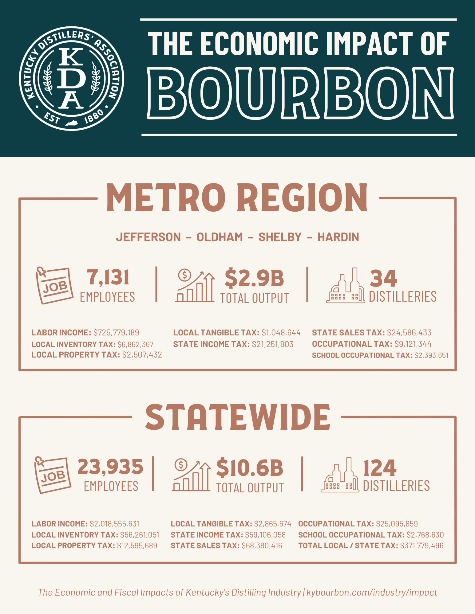
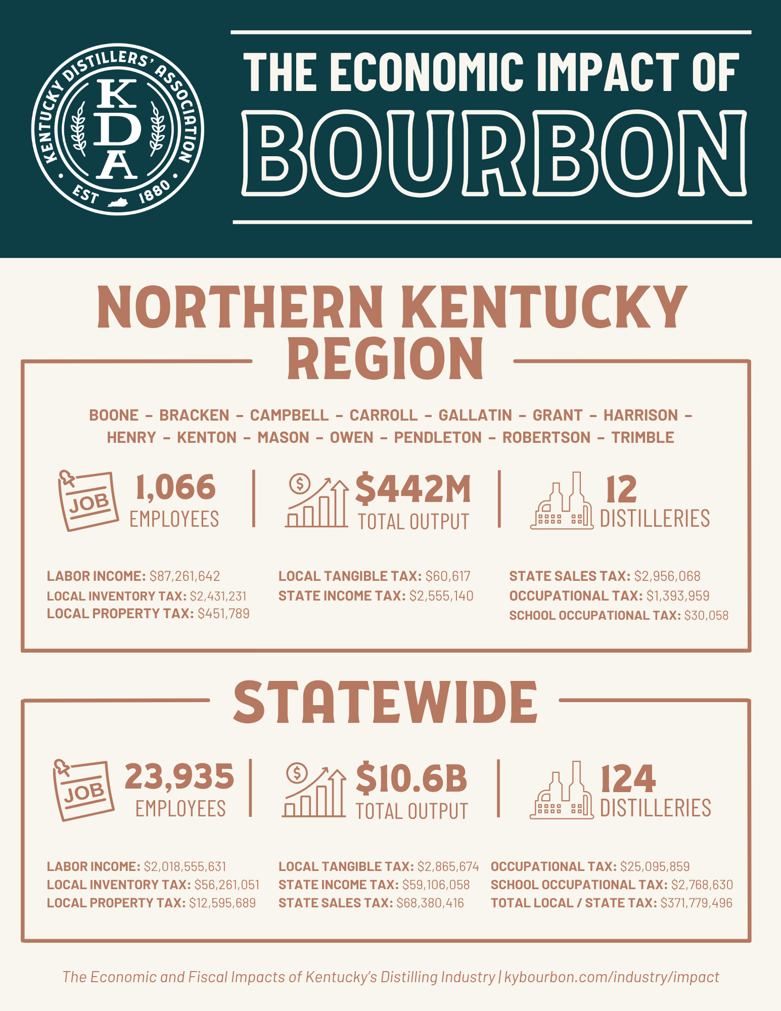


If I were to go back now and edit these designs yet again, I would likely try to simplify the number of double lines used on the county documents or create one continuous line throughout the whole sheet. I would also try to keep the format more consistent between county and regional documents.