When I first started building Clair De Lune's identity, I wanted to both verbally and visually communicate exactly what the brand was about through the logo. "Clair De Lune" directly translates to "moonlight," - thus, the name means "Moonlight Coffee Co," a perfect representation of the business model. I wanted the logo and fonts used to do the same thing - thus, I chose lighter, more whimsical typography and a dreamy logo mark to represent the brand.
I played around with some other ideas and variations for this logo, including a moon with coffee bean stars, adding fill and color to the final logo, and shooting stars coming out of a cup - however, none of them really communicated the feel I was going for until I created the final icon. The cup provides clear context about what can be found at the business, while the moons and stars act like steam pouring out from the cup, adding uniquely vivid imagery and background to the brand.
I chose to keep the logomarks simple for this brand, including only one combined logo, with the individual pieces represented separately for use in all branded materials.


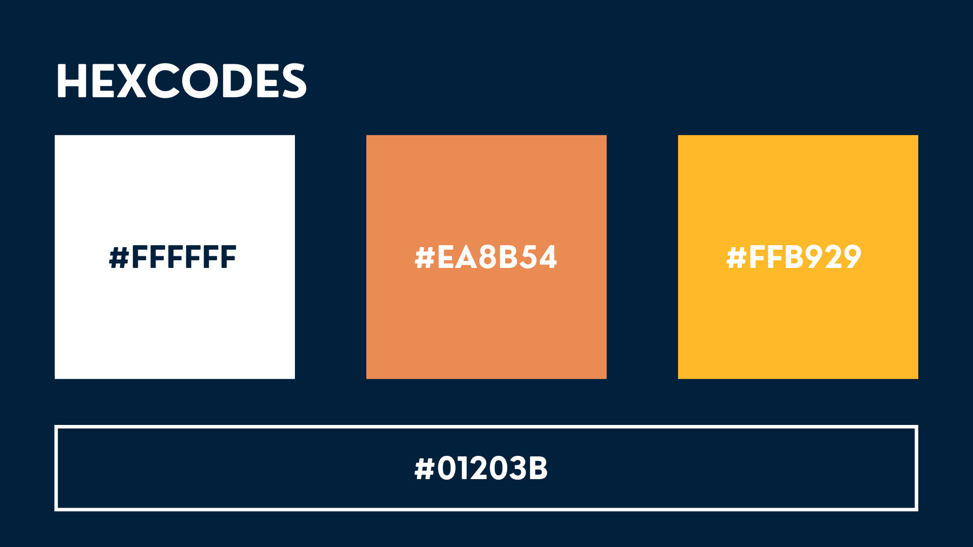


I kept this brand guide fairly standard, but intentionally zoned in more on visuals than voice. Included in the guide are standard elements like brand colors, typography, and logo usage, but I went beyond that by adding visual elements like sample gradients, approved icons, and appropriate imagery. However, I did not leave out brand voice either - wanting to help employees communicate confidently, yet genuinely, I added some simple guidelines about brand voice and tone to direct business messaging (primarily for social media and advertising purposes).
My goal with choosing the brand's colors was to strike a balance between dark and bright - emphasizing the fact that people are living out their daily lives at night, just as much as others do when the sun is out. Brand imagery was selected to be moody, yet calm; busy, yet quiet. Since the coffee chain would operate primarily in highly urban, modern, and well-traveled U.S. cities, the chosen visuals are intended to reach & resonate with both local and foreign audiences.
I wanted employees who picked up this brand guide not just to know the what of the brand, but also the why - empowering them with both branding intentions and instructions so that they didn't feel creatively compromised or boxed into only one visual / messaging style. Were I to make any updates or changes to this brand guide, I would simply build out an additional page or two with some of the ad or social media post examples included below to provide context for brand voice and messaging.


OOH collateral is key to Clair De Lune's marketing & advertising strategy, since major U.S. cities like Chicago, Atlanta, Los Angeles, and New York (where CDL locations would be) have some of the highest OOH usage rates in the country. Starting off with the shop sign, I wanted the full logo represented clearly to denote store location and to communicate what could be found inside.
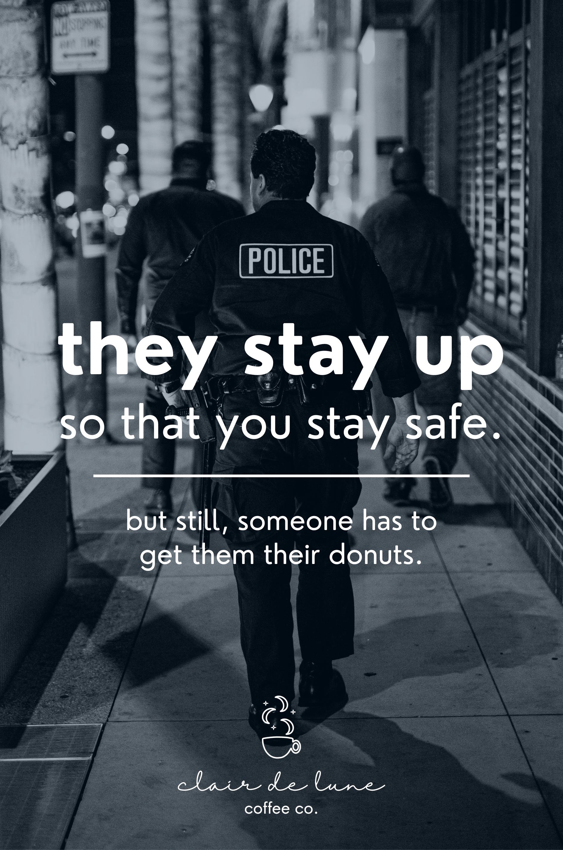
The second image is a sample OOH digital ad created simply to build community, resonance, and relatability with the people of New York City. Paired with other OOH ads that celebrate and empower night-shift workers, the goal was to both create relationship between brand and consumer, while also bringing awareness about the lives of night shift workers to those outside of our target market.
The menu shown is just one of a few menu designs for Clair De Lune. Since Clair De Lune operates on a night schedule to align with the work shifts of our target market, a permanently viewable menu displayed on the storefront would allow potential customers to see all that we really offer whether or not they traditionally worked night shift. While night shift workers are the primary brand audience, other segments like first responders, new parents, and frequent travelers are also potential stakeholders with whom collateral like the OOH menu could be especially relevant.


Here are a few more ad examples targeting Clair De Lune's main audience, involving strategic messaging and location placement to maximize impact. Shop locations would be found in highly trafficked areas like airports and subway stations where ads like these would be helpful. This ad campaign is intended to be witty, inspiring, and relatable with short, memorable verbiage. The hope with this ad campaign and messaging style was that viewers in CDL's target market would walk away feeling seen and empowered, while viewers outside of the target market would feel a sense of awe and even FOMO or outsider desire to be part of the community that Clair De Lune was celebrating.


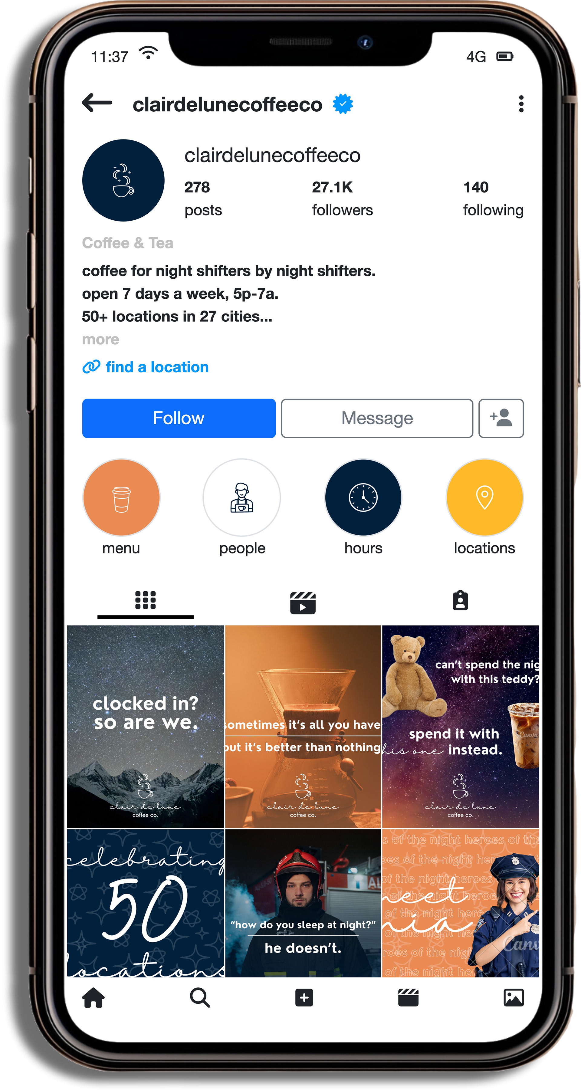

Physical brand elements are just as crucial to Clair De Lune's brand presence as the digital ones - direct mail and packaging are the primary physical elements represented in Clair De Lune's marketing arsenal, along with a social media profile mockup that CDL's audience would be seeing consistently through their physical device day-to-day. Each of these designs is intended to be simple and clean, yet eye-catching to keep the viewer engaged for as long as possible. Direct mail, such as the postcard shown, would be used specifically for frequent customers local to stand-alone shops (not within airports or other gated areas) alerting them about events and promotions, providing coupons, and other relevant, store-specific information.


These graphics would be used on social media platforms such as Instagram and Facebook to create the same type of engaged audience and community-building effect that the OOH ad campaigns would. Once again, these graphics are focused on memorability and simplicity, while also communicating exactly who our product is for.