


The name "Wildwood Wares" was chosen to reflect specific elements of the business. "Wild" to communicate freshness and authenticity as a nod to the fact that every product would be from real, quality wood instead of manufactured materials. "Wood," of course refers to the material composing the products, and "Wares" was used to suggest a "homegoods" centered inventory, while staying generic enough to expand the product line outside of the kitchen & dining realm if desired later on.
The logo is designed to further clarify the company name so that when viewed together, potential customers would have a better idea of what the business was about. After experimenting with logo concepts involving wood, logs, wood veins, and cooking tools, I eventually landed on the shown logo to convey a niche in kitchen and dining goods. I worked with this concept in some different solid forms before deciding to go with the lighter, open, wiry outline of the plate and dinnerware to illustrate the freedom, flexibility, and creativity made possible through hand-crafting wooden pieces. I also decided to use the stacked W's to provide a stronger, solid brand element to pair with the logo.
If I were to change anything, I would try to find a way to eliminate the extra word mark (stacked W's) for simplicity's sake and instead create a logo icon that visually looks solid and sturdy, while still keeping the original tone and goals of the logo.
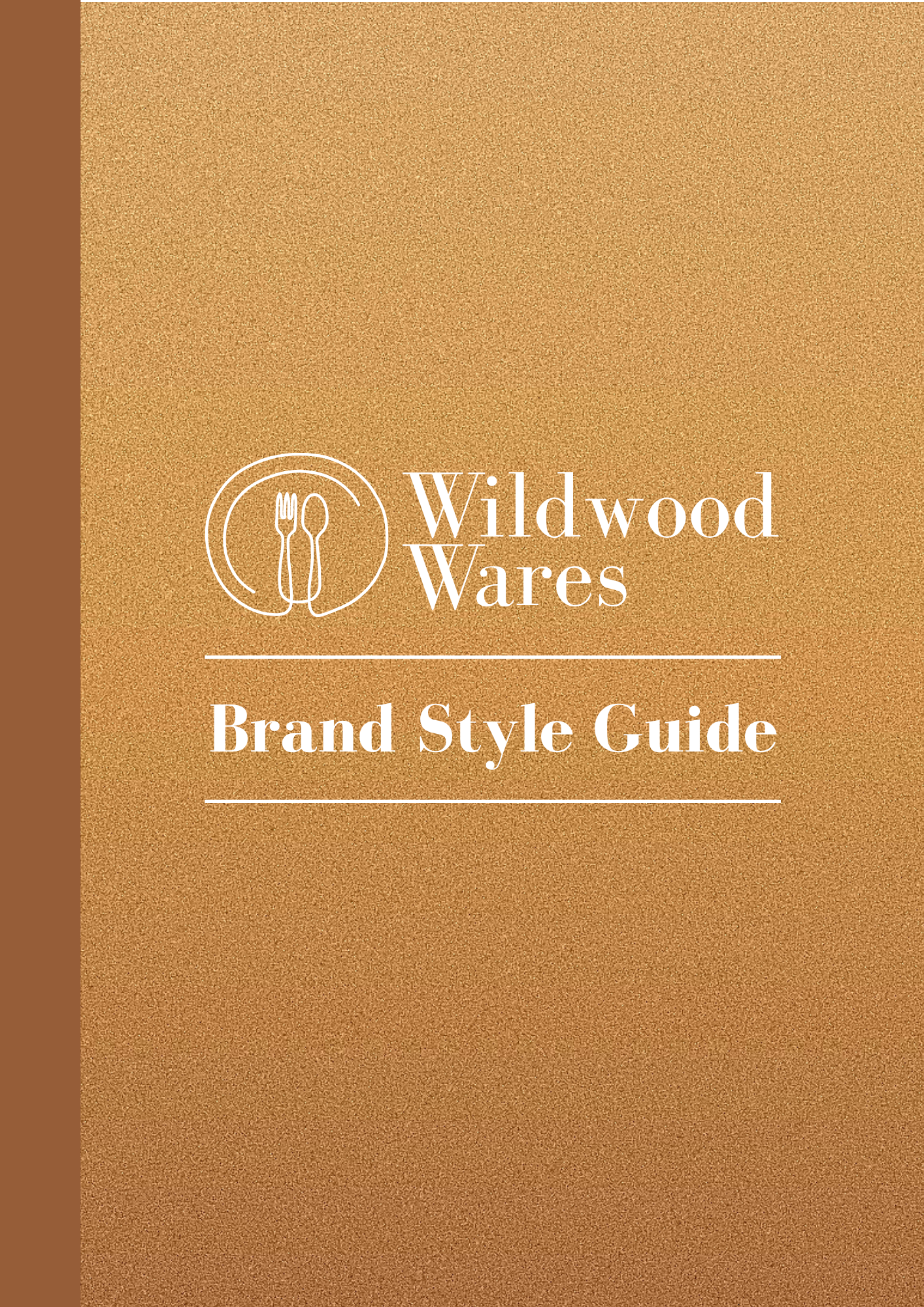


In this brand guide, the hope was to provide all of the branding information needed for an employee to use in creating brand-aligned assets and collateral. The brand guide is vertically designed as a subtle nod to the tree & wood theme of the company. Lines and all brand colors are used throughout the guide to give additional direction about color pairing and permitted visual elements. If I were to make any significant changes to this guide and branding, I would remove several of the brown tones used in the color scheme and probably add one or two secondary / accent colors to keep it balanced.
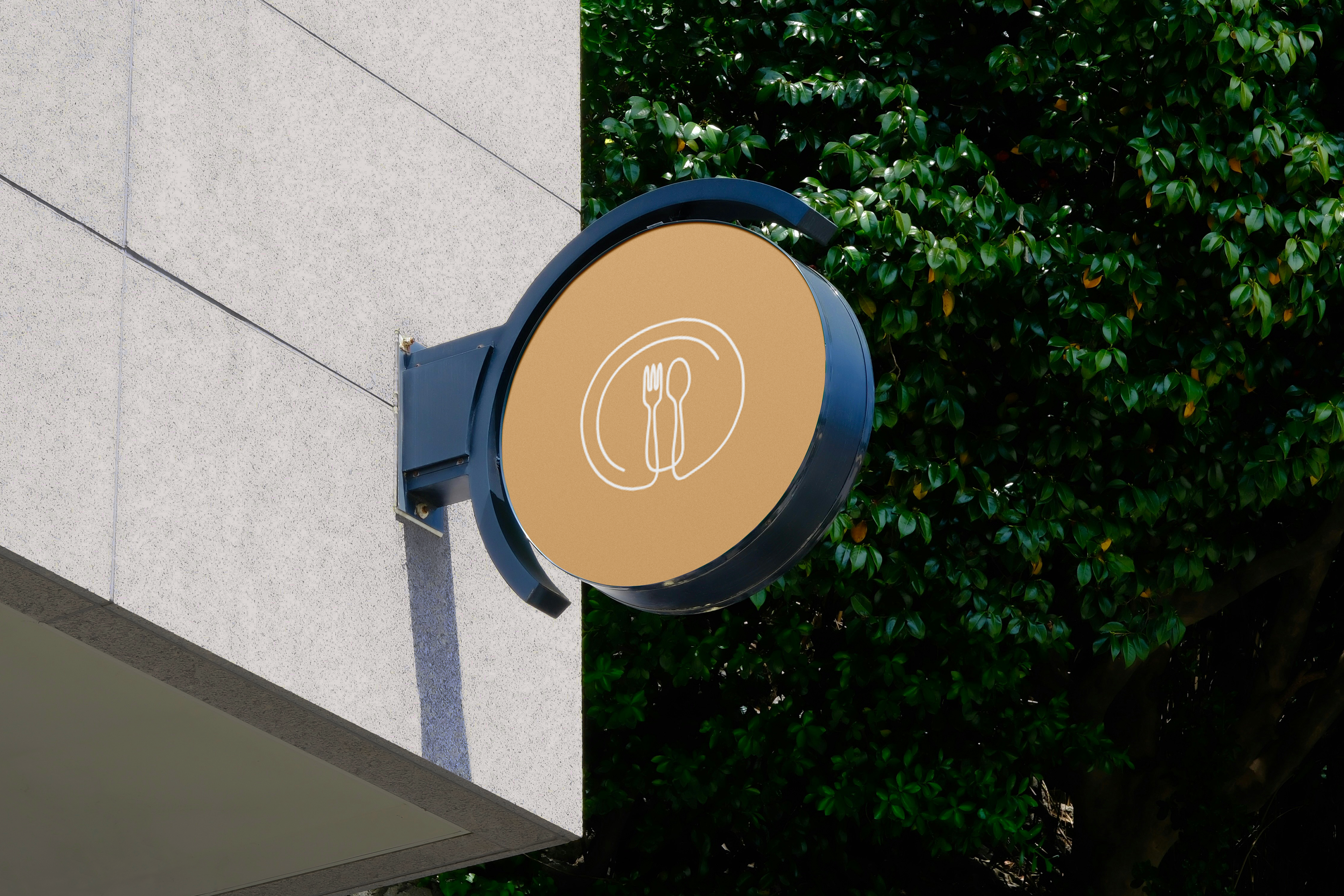


These OOH pieces each serve unique purposes. The store sign is intended to be paired with "out front" signage using the full store name as opposed to putting the entire combomark on the projecting sign itself. I did try using other logomarks and imagery for this sign, but ultimately thought the naturally round logo mark looked cleanest with the round projecting sign. I also went with the primary light brown tone for the background to catch the eye of pedestrians walking by, as the deeper browns would likely blend into the outdoor environment and stand out less.
The billboard provides potential store-goers with context about where to find the nearest physical location, in addition to imagery peeking out from the far side revealing what to expect there. I went with more of a playful tone for both the design and the messaging of this sign to make it memorable, relatable, and to spark curiosity with just a quick glance.
The digital poster is part of an awareness campaign about Wildwood's commitment to environmental preservation and stewardship. Here, I went with imagery intended to communicate what the company does with wood scraps in order to prevent wood waste. The headline is strong and committed, yet purposefully kept a bit vague to draw viewers in and instill desire to learn more. If I were to update this design, I'd place the logo at the top center of the poster to make it more prominent and shift the copy down on the image to compensate, adding blending or a gradient to help some of the secondary text stand out better.


The product flyer provides a long-touch, physical customer experience with Wildwood's brand and product offerings. While personalized as shown in the image above, I also made versions of this flyer that were generic for handing out in person to new walk-ins seeking additional information. My goal for this flyer was to help it feel sophisticated and organized, as well as bright and airy. Looking now at this flyer, I see needs for left-aligning the text and adding some white or negative space to provide greater visual contrast throughout the flyer. I also focused too much on the qualities Wildwood was seeking to embody through the products, rather than dialing in on the products themselves.
The postcard is intended as a direct mail piece for individuals who'd signed up for promotional advertising or who had previously purchased from Wildwood. The back of the postcard (shown) was created as a coupon announcement with the visual layout of the mailer mimicking the items on sale. I selected bright, vibrant imagery to show possible uses for the sale item and create color contrast.
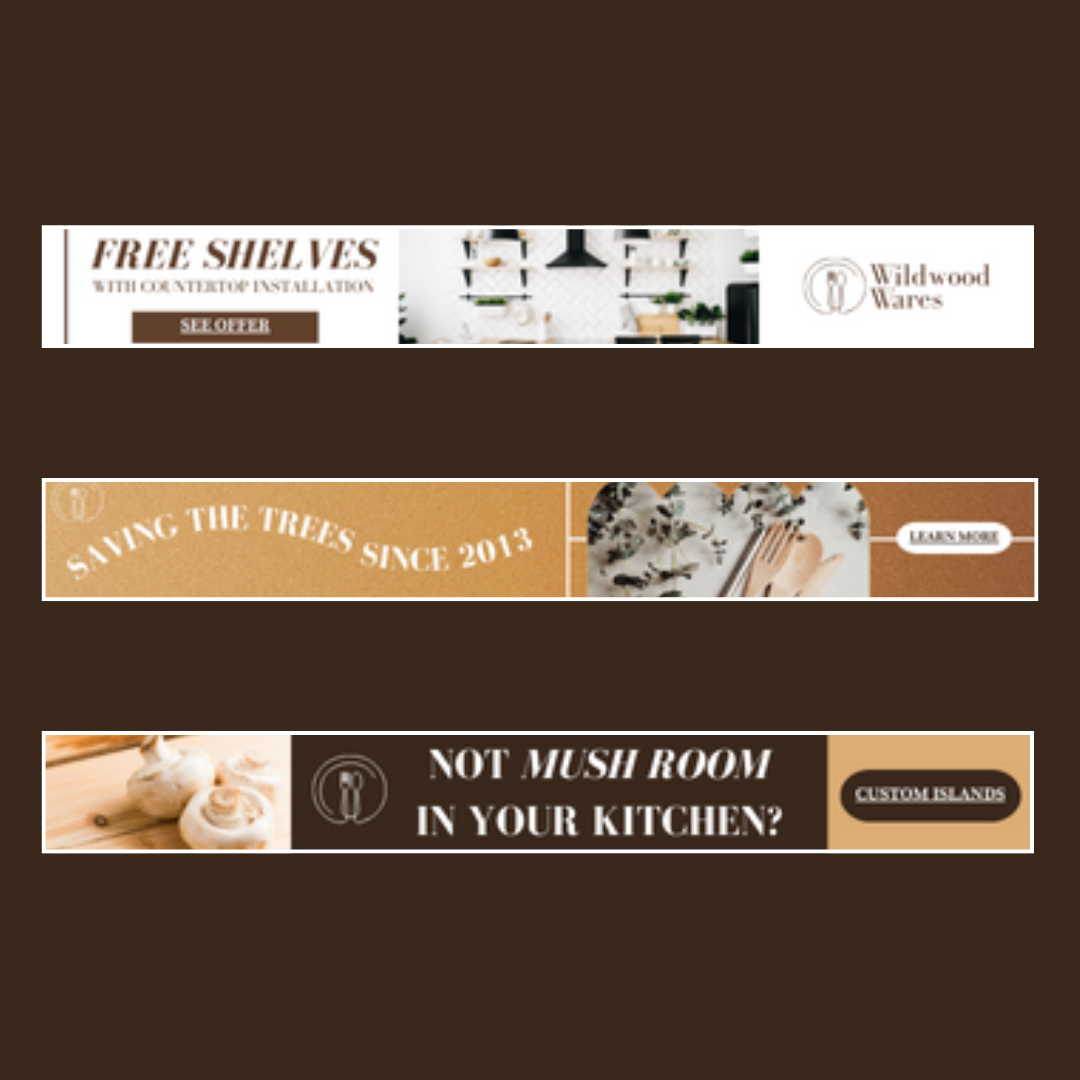
The digital display banner ads each intentionally have a different visual theme (duotone, gradient, and full brand colors), but all are created to serve as a strong first touchpoint for viewers who had never interacted with the brand before (ideally viewers would see all three ads to provide lots of experiences with the brand). One is a bold promo offer, another is a play on words to draw amusement and intrigue from the viewer, and another portrays Wildwood's mission in a unique light.


The above images portray sample social media posts and an app concept for Wildwood Wares. The post samples were created for the brand guide to help internal staff understand the feel that combining Wildwood's tone and visuals would communicate.
Though not fully built out, the app concept was designed simply to provide a developer with the basics of what Wildwood might desire in a simple mobile app. All screens on the app would have a menu at the bottom for navigating to main tabs, including Shop (linking to Wildwood's product catalog), Recipes (linking to a recipe collection that specifically use Wildwood products), and Profile (linking to settings). The app would also have a tab for stored coupons and a tab for making a wishlist.
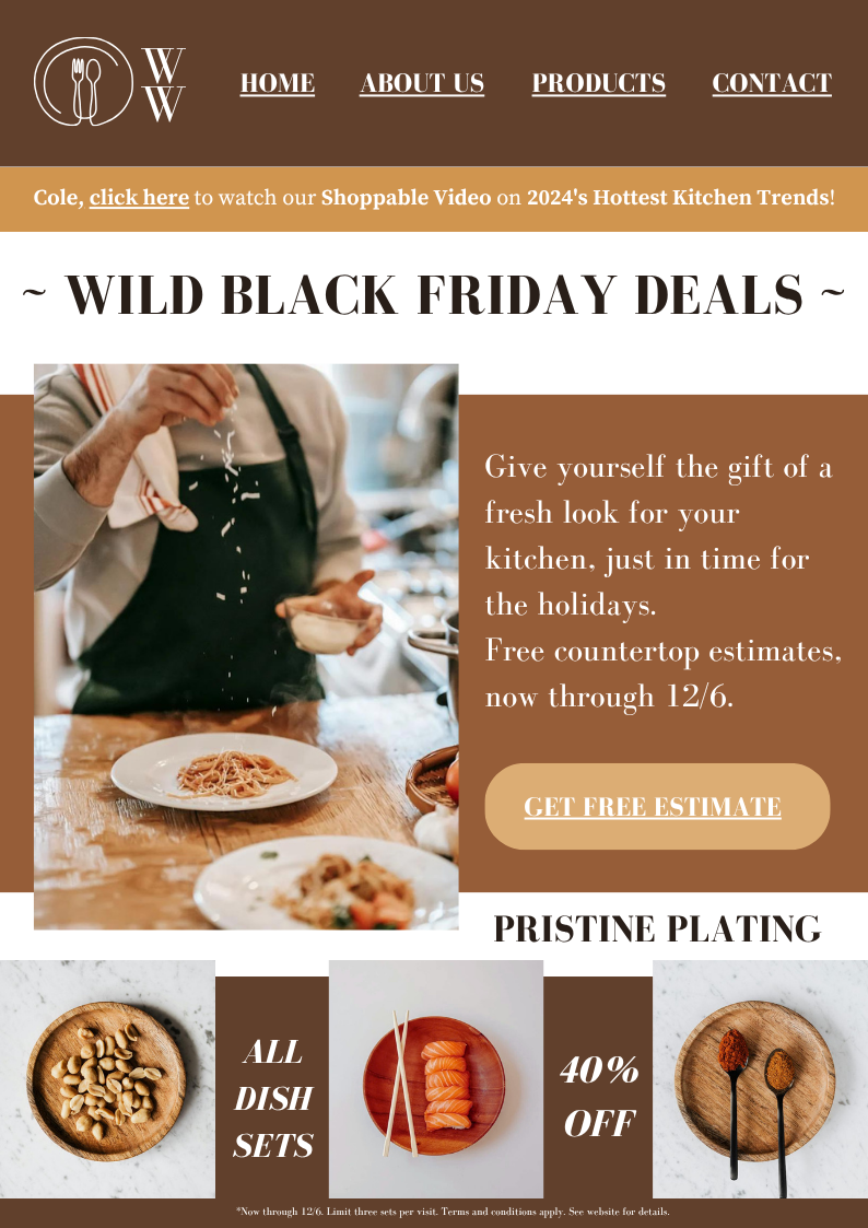

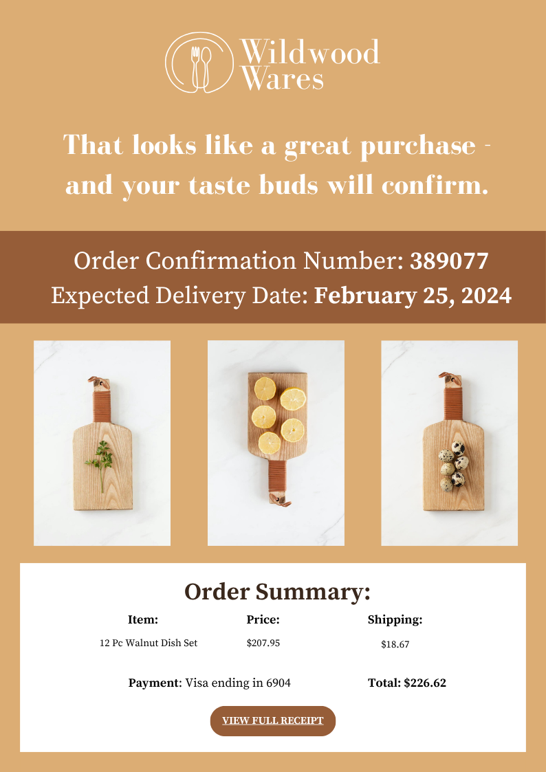
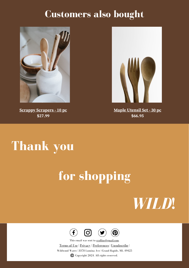
These email mockups were designed as samples for building a more expansive email marketing strategy. Desiring to make these emails heavy on visuals and light on copy, I stuck to using the same vibrant images of food and wood products that would help provide contrast to the brown color scheme. I also leaned into the playful side of the messaging tone to keep viewers reading.